Med Medical: Multi-Brand AEM Design System
A scalable enterprise design system supporting reusable AEM components, responsive layouts, Important Safety Information (ISI) content, and multi-brand healthcare experiences.
Role Focus Areas Tools / Platform
UX/UI Designer Design System Figma
AEM Components Adobe Experience Manager
Responsive Design Design System Documentation
Multi-Brand Theming
This case study is based on client work completed during my time at Accenture. Client-identifying details, proprietary assets, internal documentation, and brand-specific information have been anonymized or recreated for portfolio
Why a Design System Was Needed?
Med Medical needed a scalable design system to create consistency across multiple healthcare brands. Each brand had its own visual identity, but the experience still needed to follow shared rules for layout, accessibility, responsive behavior, component structure, and Important Safety Information (ISI) content.
The goal was to create a reusable AEM component framework that allowed each brand to feel distinct while maintaining a consistent user experience across the overall platform.
Consistency Across Brands
Standardized visual and interaction patterns while allowing each brand to keep its own identity.
Reusable AEM Components
Created shared component rules that could be applied across product pages without rebuilding each experience from scratch.
Shared UX Rules
Defined guidance for typography, spacing, layout, responsiveness, image behavior, and ISI content structure.
My Role & Contribution
As a UX/UI Designer, I supported the creation and documentation of a scalable AEM design system for multi-brand healthcare experiences. My work focused on translating shared design rules into reusable foundations, component patterns, responsive layouts, and brand-specific applications.
Defined and documented design system foundations including typography, containers, object styles, breakpoints, layout grids, and image focal point behavior.
Supported reusable AEM component patterns for buttons, hero sections, cards, forms, navigation, and ISI.
Applied brand-specific visual rules while maintaining consistent component behavior across multiple healthcare brands.
Created responsive design guidance to show how components adapt across desktop, tablet, and mobile layouts.
Helped organize component documentation so design, authoring, and implementation teams could follow consistent standards.
Design System Foundations
The foundation layer established the shared rules that allowed the design system to scale across multiple brands. These foundations helped keep typography, spacing, layout behavior, image handling, and component styling consistent across AEM experiences while still allowing each brand to apply its own visual identity.
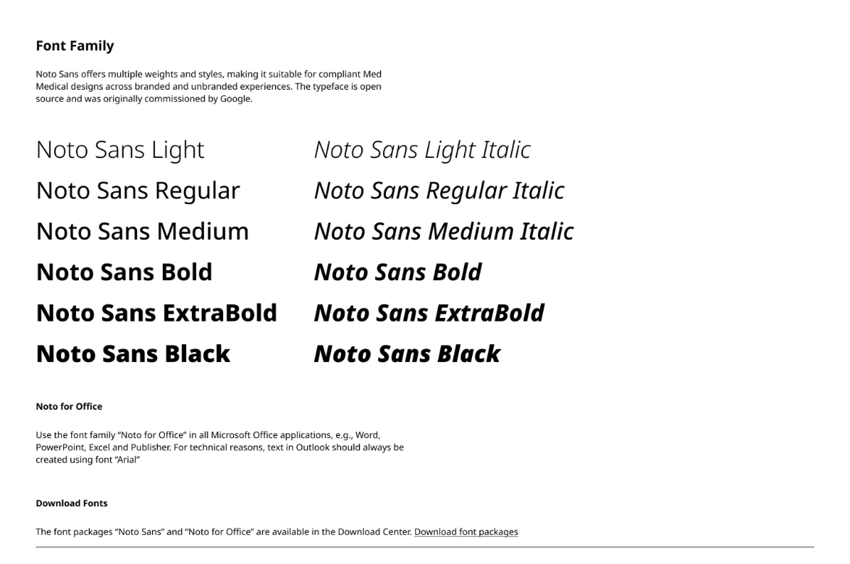
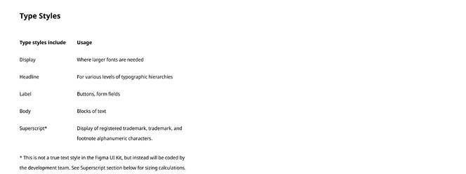
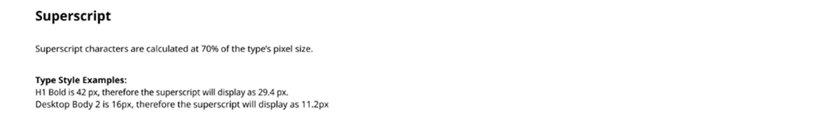
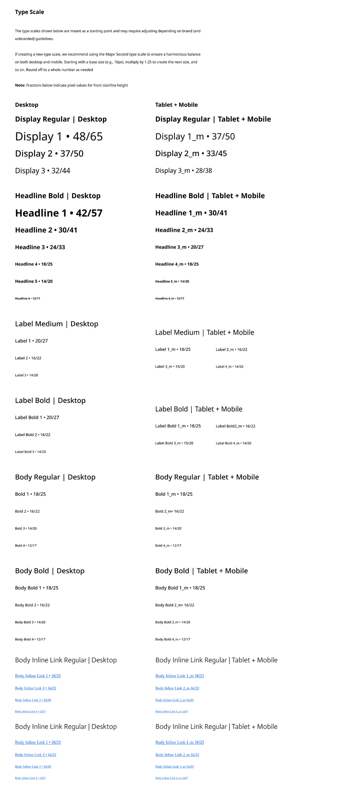
Typography
Typography was one of the core foundations of the system because healthcare pages depend on clear hierarchy, readability, and consistent presentation of Important Safety Information (ISI). I created shared typography rules for font usage, type scale, responsive behavior, and supporting text styles so content could remain clear across brands and breakpoints.
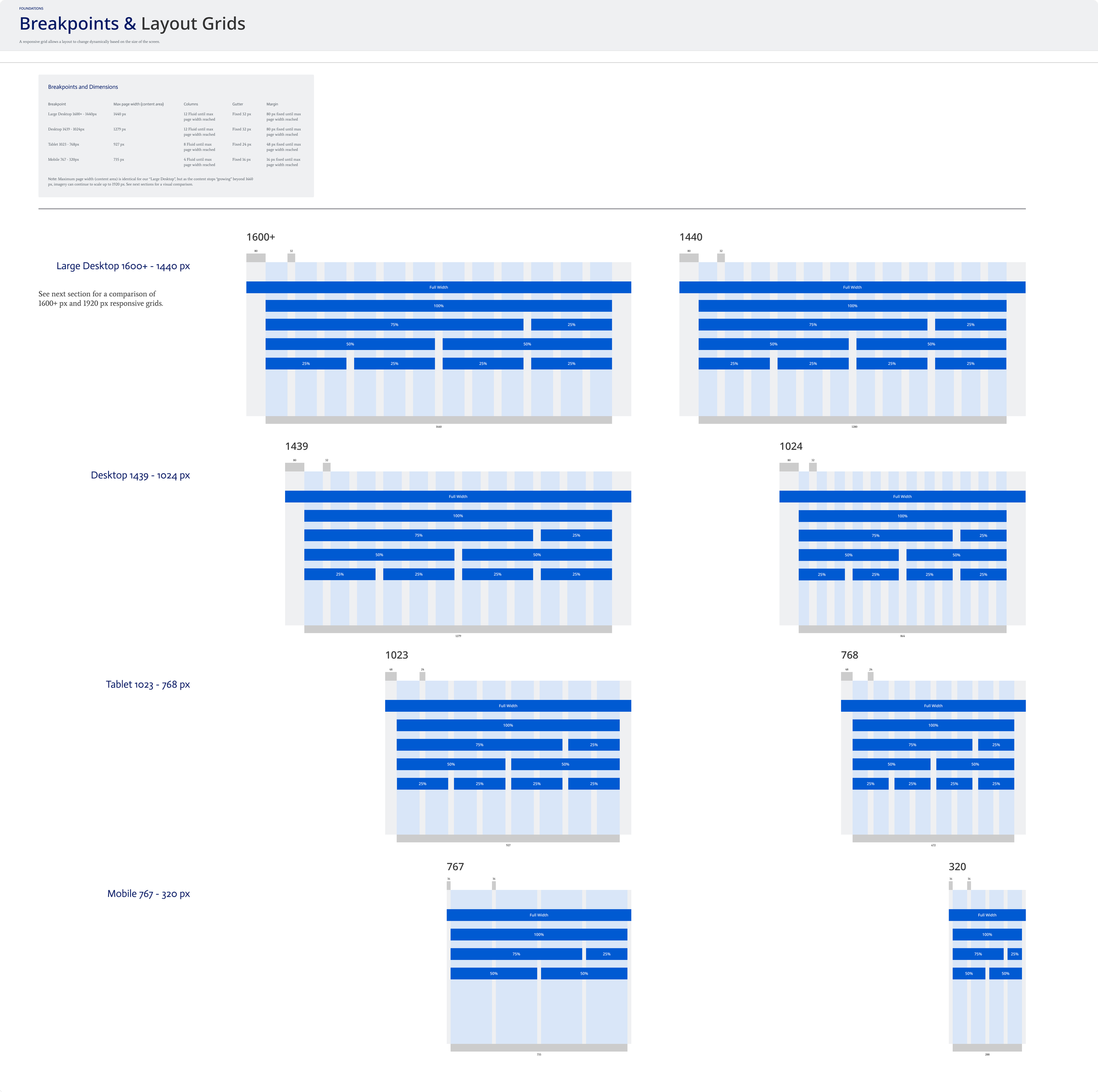
Breakpoints & Layout Grids
Breakpoints and layout grids were defined to make sure AEM components behaved consistently across desktop, tablet, and mobile screen sizes. These rules helped standardize how content aligns, scales, and stacks across brands while giving designers and authors a clear framework for responsive layouts.
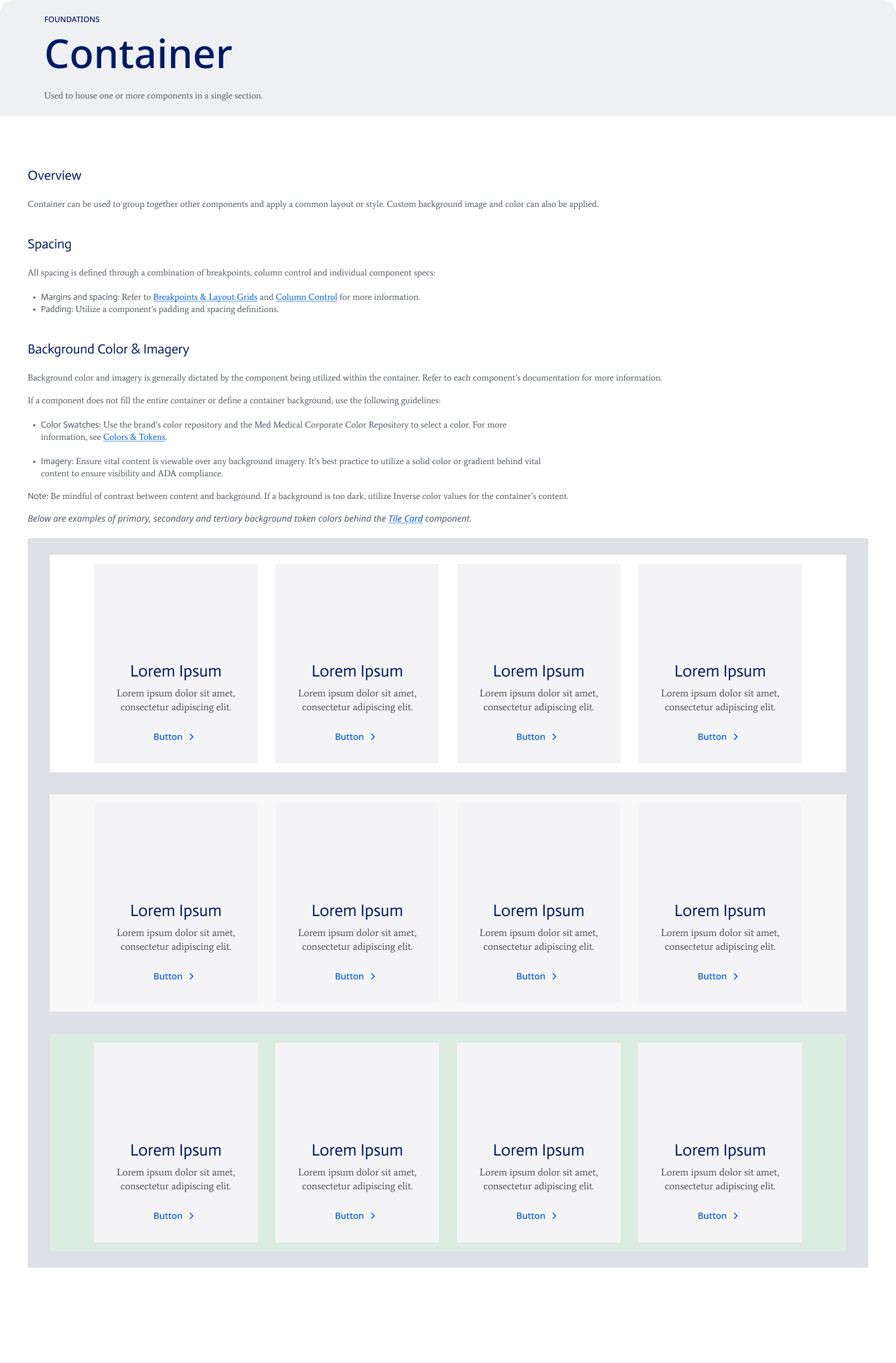
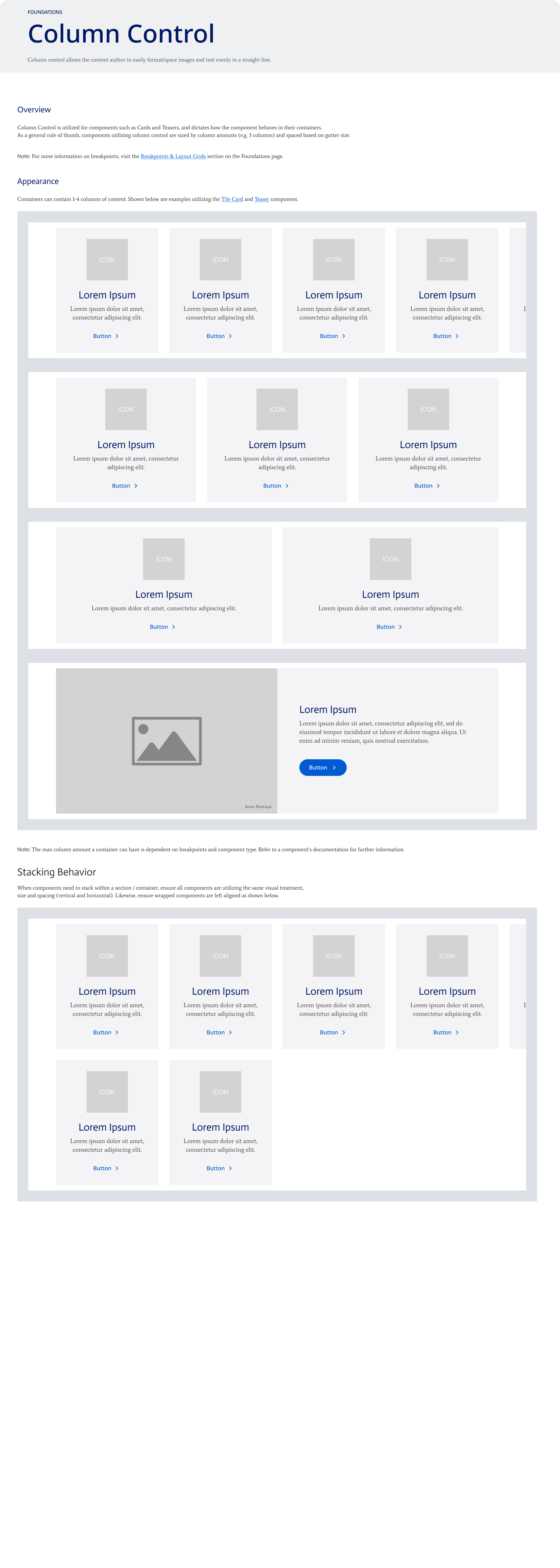
Container & Column Control
Container and column control rules helped standardize how content sections were structured across AEM pages. These foundations defined how components could be grouped, spaced, aligned, and stacked across different screen sizes while allowing each brand to apply its own visual styling.
Component System
After establishing the foundation rules, the design system was applied to reusable AEM components. Each component was documented with consistent structure, states, responsive behavior, and brand theme flexibility so teams could reuse the same component logic across multiple healthcare brands.
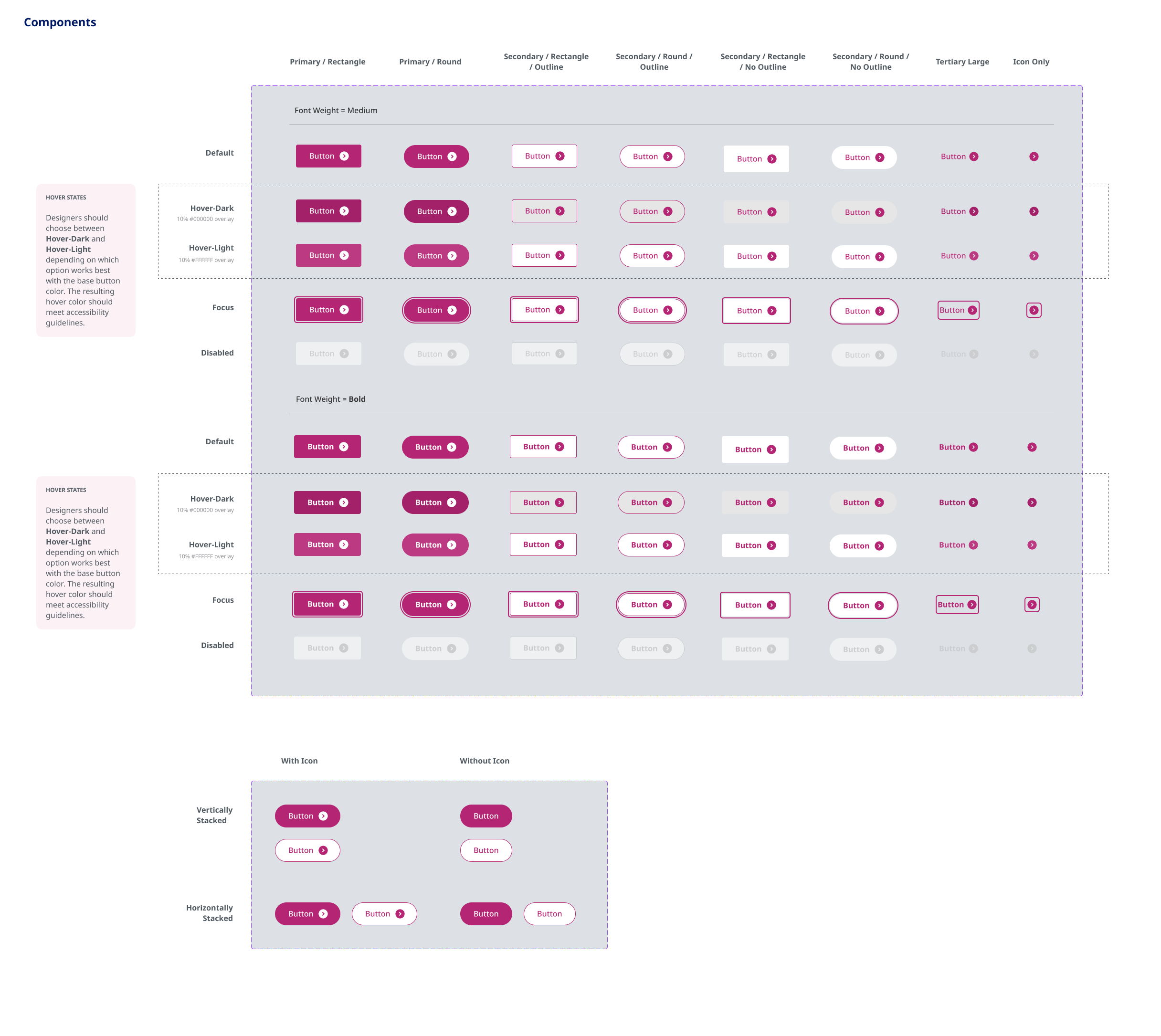
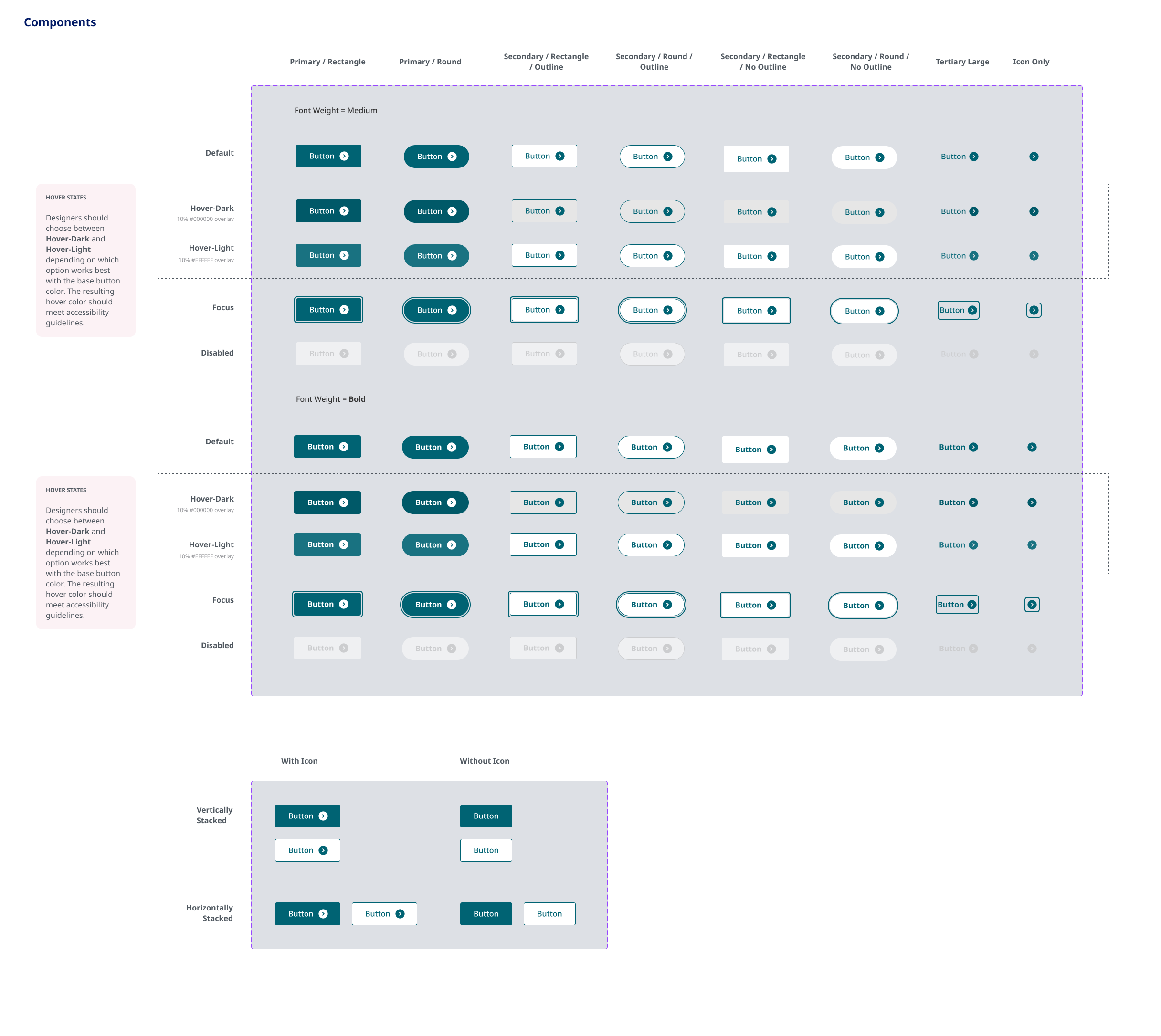
Button Component
The button component was designed to support consistent interaction behavior across brand themes. While colors and visual treatments changed by brand, the structure, states, icon usage, and accessibility expectations remained consistent.
Supported primary, secondary, tertiary, and icon-only button variations.
Documented default, hover, focus, and disabled states.
Allowed brand-specific colors while preserving shared component structure and behavior.
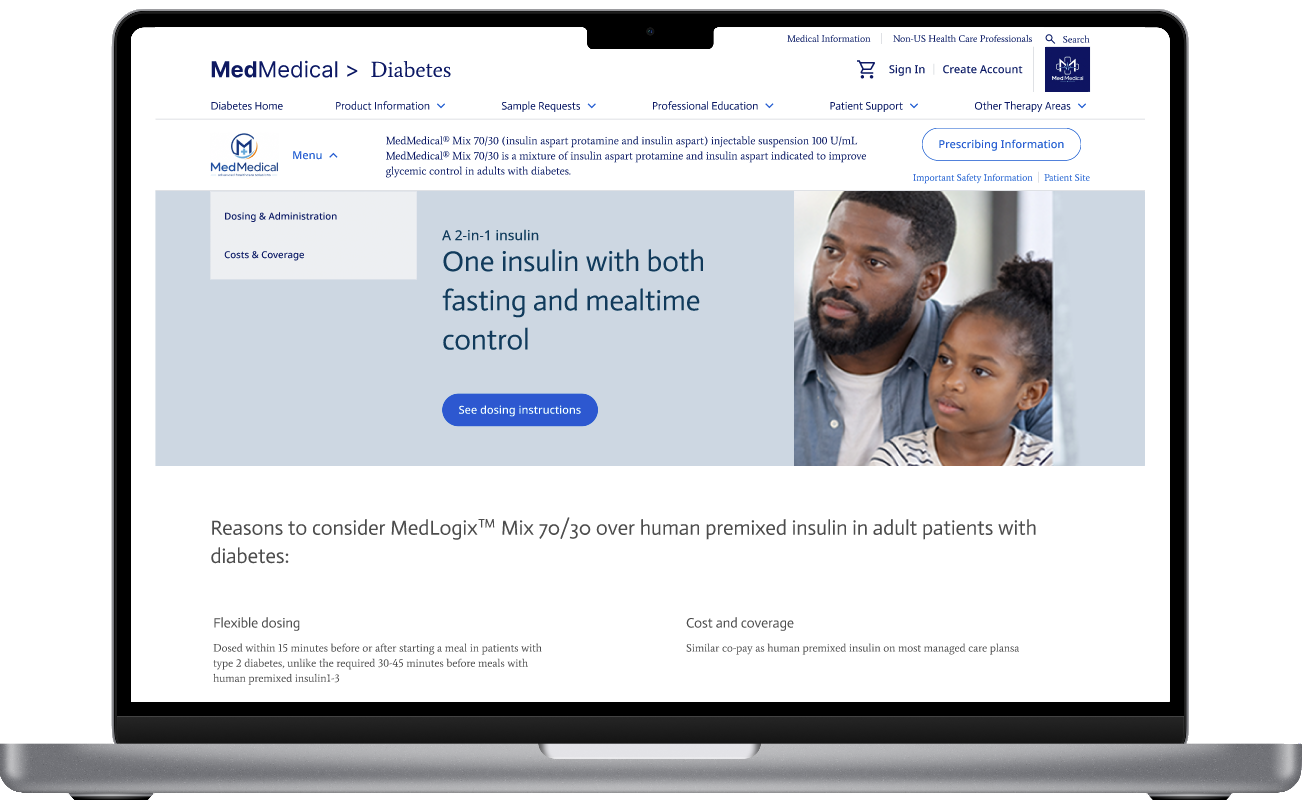
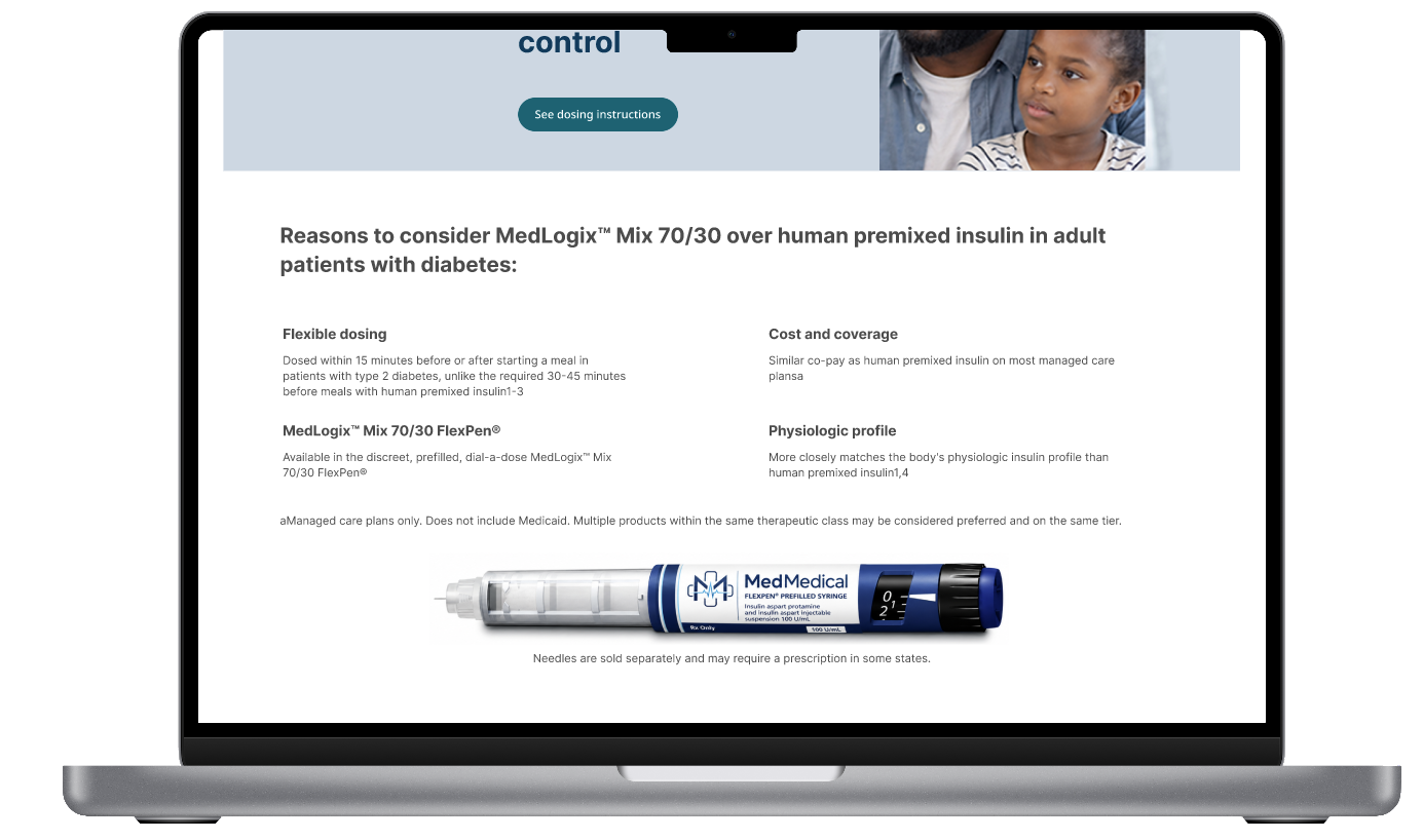
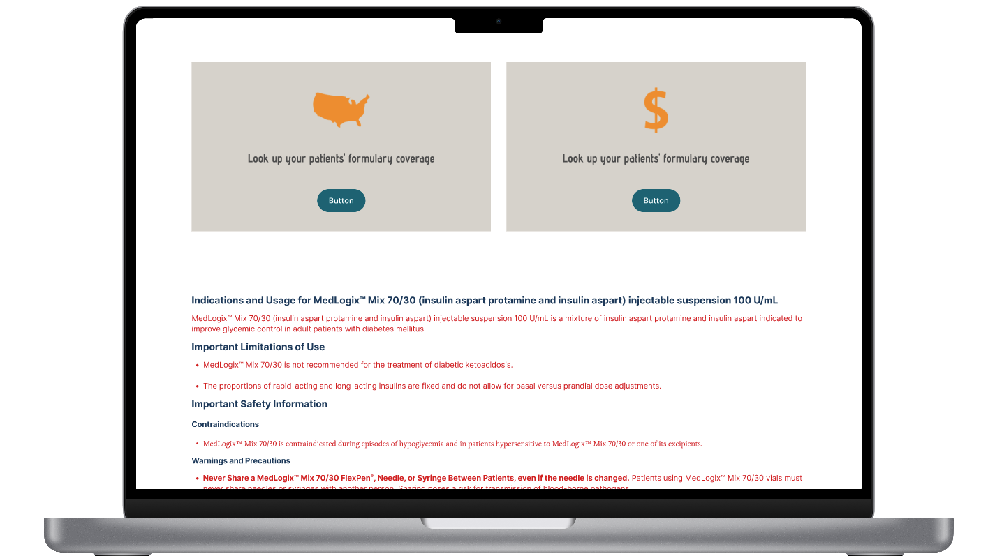
System in Action
The design system was applied to full AEM page experiences to show how shared foundations and reusable components worked together. Across the brand examples, the page structure, navigation, typography hierarchy, component behavior, and Important Safety Information (ISI) placement remained consistent, while each brand applied its own visual identity through colors, logos, imagery, and button styling.
Outcome & Reflection
This design system helped create a consistent framework for building and maintaining multi-brand healthcare web experiences in AEM. By defining shared foundations, reusable component behavior, responsive rules, and brand-specific styling patterns, the system supported consistency without removing each brand’s individual identity.
Created consistency across multiple healthcare brand experiences.
Standardized typography, responsive behavior, and component documentation.
Supported reusable AEM component patterns across brand themes.
Helped maintain clear Important Safety Information (ISI) structure across pages.
Made it easier for design, authoring, and implementation teams to work from shared rules.
One of the biggest takeaways from this project was learning how to balance consistency with flexibility. The system needed to be structured enough to create alignment across brands, while remaining flexible enough to support different visual identities, content needs, and healthcare-specific requirements. This reinforced the importance of designing systems that can scale without becoming rigid.