Sabo International Market - Full Mobile Redesign
Reflecting growth, UX maturity, and a mobile-first approach for a better shopping experience

Sabo International Market - Full Mobile Redesign
My Responsibilities
Mobile-first UX / UI design prototyping, user flow improvements, and visual design alignment
Project Overview
After completing an initial redesign for Sabo International Market, I reflected on ways to better support mobile shoppers, improve usability and align the experience more closely with brand value.
This updated mobile-first redesign focuses on:
Clean, accessible UI
Clear product discovery
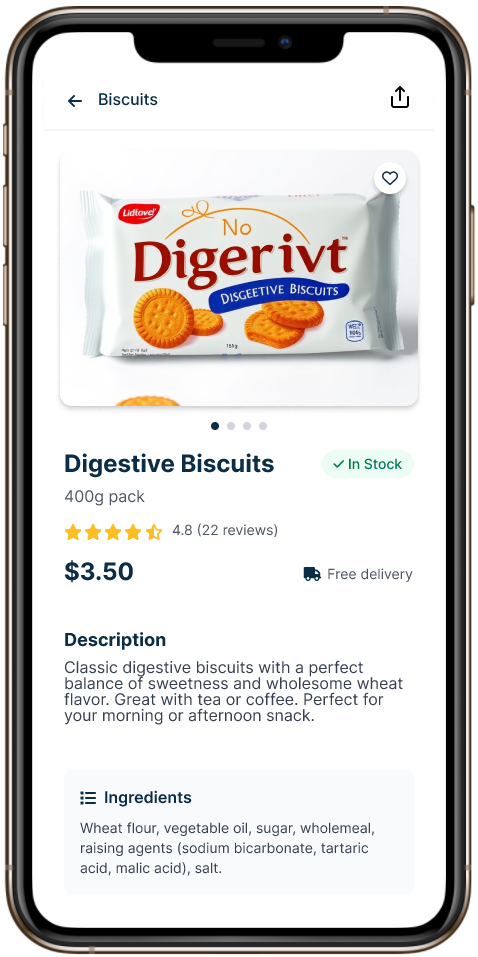
Stock availability visibility
Faster, simplified checkout
Stronger visual brand identity
The goal was to create a smoother, more trustworthy mobile shopping experience for culturally diverse customers.
Problem Statement
The original app design lacked clear navigation and mobile responsiveness.
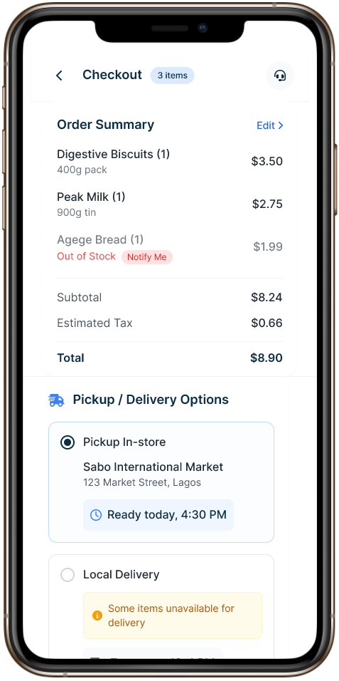
Users were frustrated by frequent out-of-stock surprises with no easy way to be notified.
The UI did not reflect the brand's trusted, high-quality image, leading to potential loss of customer confidence.
Goal
Redesign the mobile app to be clean, trustworthy, and easy to navigate on any device.
Create clear product discovery flows with availability status and smart notifications.
Strengthen the visual brand identity through modern, accessible design patterns.
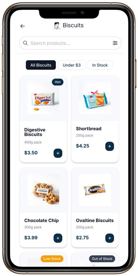
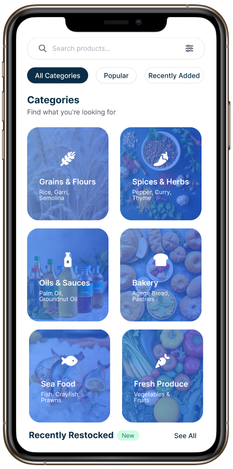
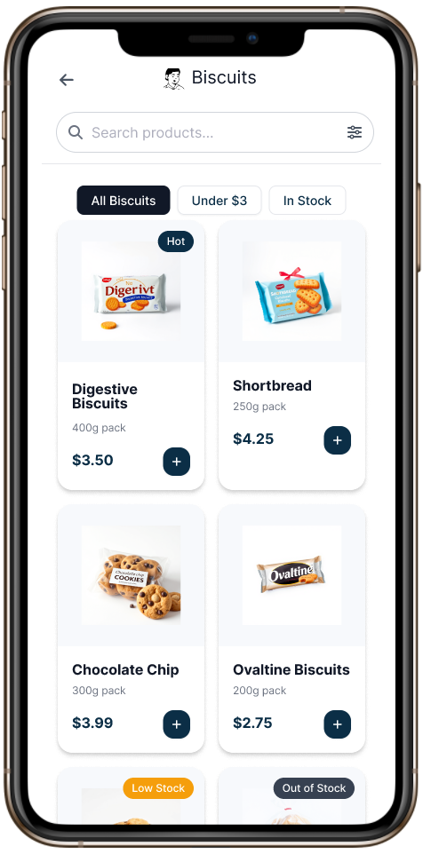
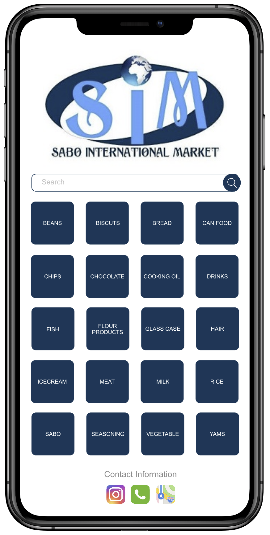
Categories
Cart

Product Listing
Checkout
Product Details
Profile

Design Decisions That Drive Revenue
Throughout the redesign of Sabo International Market’s app, I focused not only on improving usability, but also on driving stronger business outcomes through strategic UX decisions:
Recently Restocked:
Positioned returning or newly available items where users could easily spot them, supporting product discovery at the right moment.
Smart Bundles:
Added lightweight cues like “Frequently Bought Together” and “Buy More, Save More” to guide decision-making in the moment. These momentssurface timely product pairings or value-driven bundles, making the experience feel supportive rather than overwhelming while encouraging deeper engagement with the catalog.
Featured Selection:
Integrated time-sensitive product highlights influenced by usage trends and buying behavior to encourage exploration and maximize exposure to frequently purchased items.


Takeaways
Impact:
Elevated a previously outdated interface into a modern, mobile-first experience that better reflects Sabo’s quality and trust
Introduced features that guide user behavior naturally (e.g. Recently Restocked,” “Frequently Bought Together,” “Buy More, Save More”), supporting both user goals and business growth.
Reduced cognitive load and friction through clean navigation, visual clarity, and mobile-optimized flows.
Designed for real customer context (e.g. Sunday post-church shopping), aligning with user habits and motivations
What I Learned:
How to apply UX principles with business goals in mind, designing not just for usability, but also for measurable outcomes like increased cart size and user retention.
The importance of visual hierarchy and spacing to reduce overwhelm in mobile layouts.
How to translate stakeholder needs (e.g. store traffic reduction) into Feature-led UX decisions.
That a redesign isn’t just a new look, it’s a chance to rethink how an experience works, feels, and performs.
Click the mockup to interact with the new experience →
Want to experience the new design in action?
Explore the interactive prototype to see how the redesigned flow supports real user needs from browsing to checkout.

Before & After: How Far the Design Has Come
Before
Looking back at the original design reminded me just how much clarity, structure, and brand alignment a strong UX foundation can bring. This new version reflects not just a better UI — but a more thoughtful, modern experience.
After
